Role/Services
Role/Services
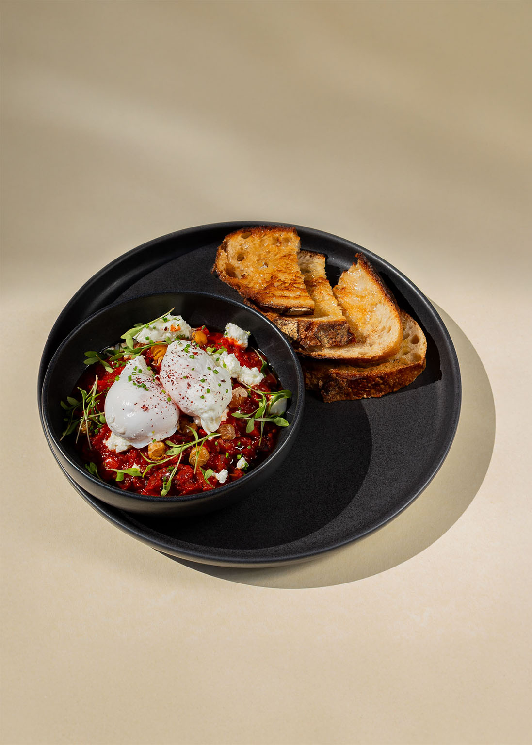
Plately is a meal kit subscription service for people who want to eat well without the stress. It brings fresh ingredients and easy recipes straight to your door, so you can throw together something good any day of the week
Plately
Year
Year
Brand Identity
Brand Identity
2025
2025
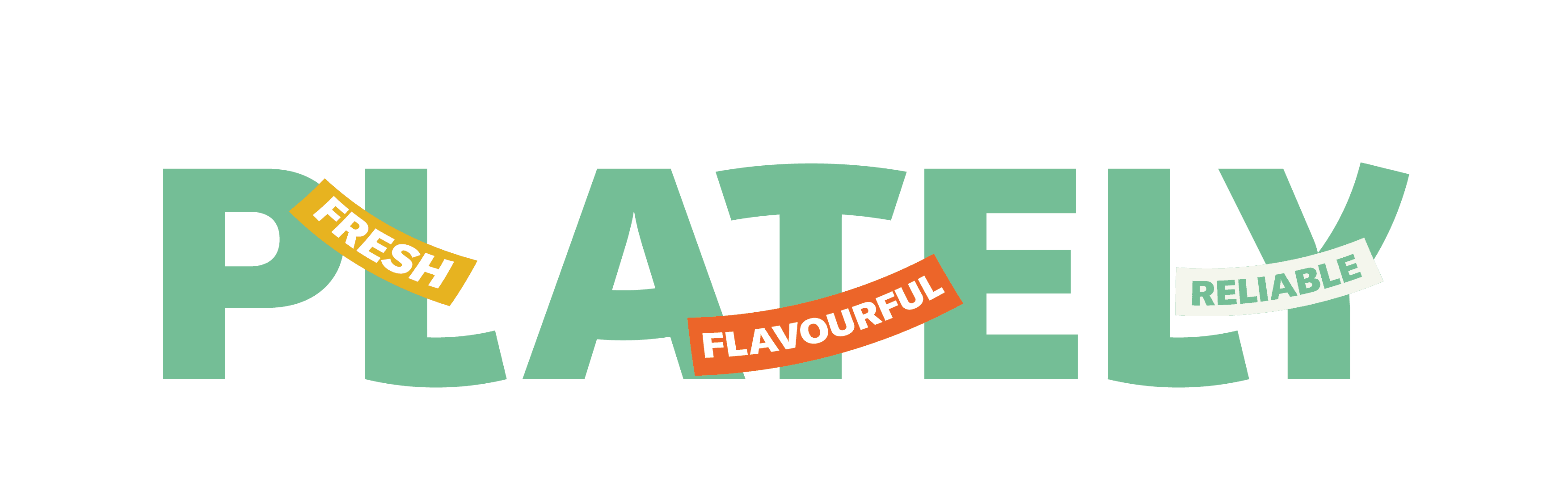
Inspired by kitchenware, and the word “plate” in the logo, the shape of the curves of plates was designed within the logo.
The secondary logo demonstrates letters piled on top of a plate as if they are fruits and vegetables.
Inspired by kitchenware, and the word “plate” in the logo, the shape of the curves of plates was designed within the logo.
The secondary logo demonstrates letters piled on top of a plate as if they are fruits and vegetables.
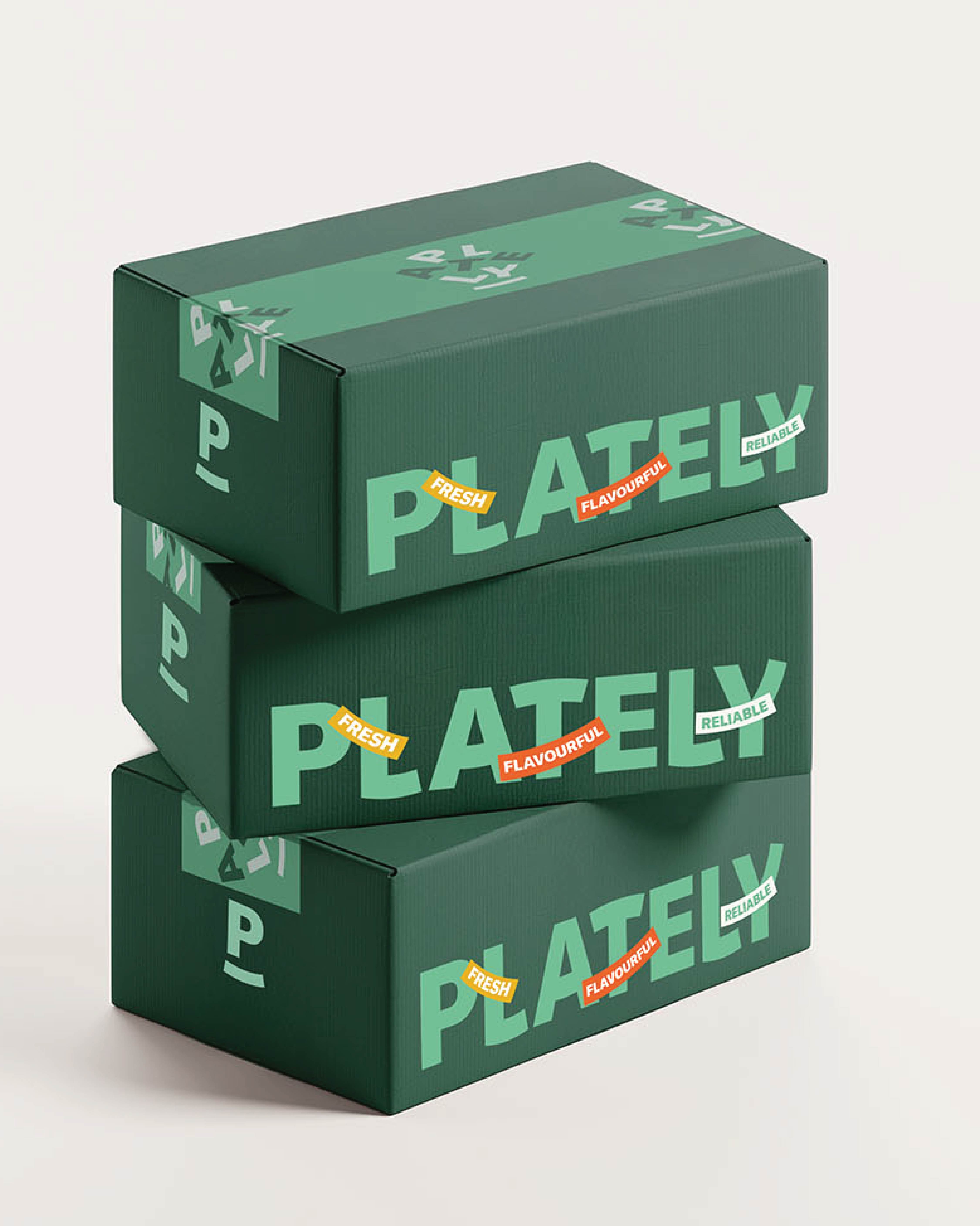

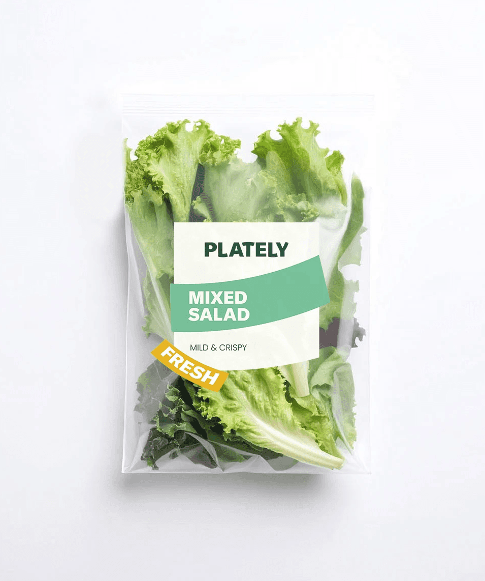
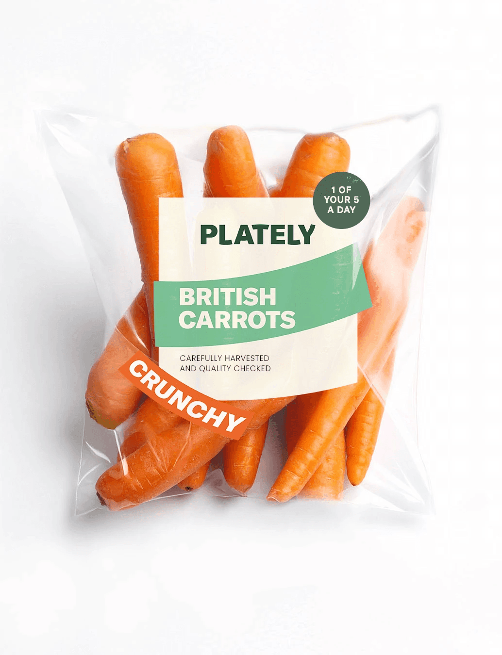

Simple and sleek packaging and recipe design, framing it as a manageable challenge that won’t complicate your week. The visual curvature of a plate is included in any branding work to maintain consistent branding.
Simple and sleek packaging and recipe design, framing it as a manageable challenge that won’t complicate your week. The visual curvature of a plate is included in any branding work to maintain consistent branding.
Next Project
The Common